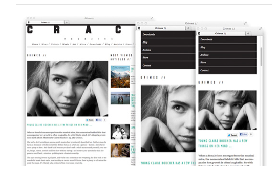
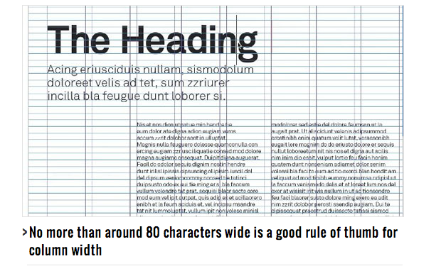
Designing for print and designing for the web have some similarities and many differences. A designer must understand these variations and design accordingly.
Type on Print vs Type on the Web
Font size
Fonts work in print at sizes of 10 or even 9 pt. For the web, splitimagestudios suggests at lest 12 or even 14 pt type.
Layout
One difference is that of the way the type is viewed. In print, obviously the type would be on a magazine, book, advertisement, etc. But on the web, all type is on a screen. Realizing this, we know that the screen gives us an unlimited amount of space, whereas print is defined by the format.
Sizing/Measurement
In designing for web, your designs are not set in stone. In print we use picas, points, and inches, or in other words, absolute measurements. But on the web, space is measured in pixels. This means that your type must be appropriate on any device and at different resolutions.
Color
A website can be viewed on all different types of devices and at different sizes, so the type color should be taken into consideration in order to create enough contrast for readers. The brightness of one computer screen may be very different from another.
A Few Pointers
When setting your type on the web, it is a good idea to use font-faces and web fonts. If you don’t use these, you’re restricting yourself to the few fonts that can be read by all browsers and computers and possibly sacrificing your design. (See Benefits of Using Font-faces and Web Fonts for more info) A few resources for web fonts are Typekit, Google Web Fonts, and FontDeck.
It is also smart to make your type and design responsive, so that it will change according to the window size or screen it is being viewed on. Relative units of measurement should be used such as ems so that the browser can adjust the type more accurately.
People reading something in print tend to take their time. Type on the web needs to be organized, concise. It really focuses on user experience.
Using CSS properties, you can control your leading, line-height, tracking, etc the way you would in print design.
If you want to kern between individual characters, the only practical way to do so is to wrap the affected characters in their own <span> tags. You can then apply CSS properties to the span, controlling the kerning. This can become a big job very quickly, so use sparingly! – Creative Bloq
Remember that many of the rules that apply to print type also apply to web type. Just to name a few:
- Choose a font that works for the subject and situation
- Don’t use a font in a way that it was not designed to be used
- Just because there are tons of fonts, doesn’t mean you should use all of them – pick a base font and one display font and stick to it
- Avoid long line lengths that discourage viewers from reading
Benefits of Using Font-faces and Web Fonts
Using web fonts and font faces allows you a wider variety of fonts to choose from. This can enhance your design and help you to locate a font that would be most appropriate for your content.
One benefit that typography.com talks about, is that computers can read web fonts. So, if your site uses web fonts, it will be more accessible to the public. This will increase readability for search engines, as well as readability for those using assistive devices. The web fonts are also more user-friendly, which is very important for the web.
it’s searchable and selectable by readers, it magnifies crisply to any size, it works with in-browser translation services, it’s clear at any resolution, and it can be used in dynamic page elements such as search bars and forms. http://www.typography.com
Web fonts even “reduce a site’s payload” because it is a single file and they help with search rankings.
Interesting Typography
The first site I chose to post with interesting type is We Are Impero, a creative agency based in London and Sydney.
Based off of the information I’ve read from the articles, I picked this site because:
- It has 2 fonts – this large, sans-serif, all caps, epic font and a contrasting serif, typewriter-looking font. I think they complement each other well. The font seems to fit the purpose – each page tells a little more about them.
- The type is large enough to read and has high contrast with the exception of the tops of the title. (The top blends in a little with the background, but doesn’t make it illegible)
- They have a mobile version of their site that has large enough type and is simple and straight to the point.
- It is interactive and user-friendly with a navigation bar and many options to share with social media.
The second site I chose is Nearly Impossible. It is a site of events for those who make and sell products.
This site has type that
- has good line lengths
- great contrast
- is light and positive which fits the site – it is has to do with overcoming challenges
- is straight-forward without any frills
- readable
- large enough on a computer screen
The only downsides:
- It was not responsive to my iPhone The type was very small and you have to zoom in if you want to read anything.
- The black type at the bottom of the page has a different typographic color than the white type on blue, and doesn’t read as easily in my opinion. The bolded words are especially dark. Maybe they could have used an italic to emphasize those names.
Sources: http://www.creativebloq.com/web-design/how-design-screen-guide-print-designers-1131786 http://www.creativebloq.com/typography/rules-web-typography-learn-rules-type-setting-web-2131890 http://www.theprintblog.com/designing-for-web-and-print/ http://www.typography.com/cloud/welcome/
http://splitimagestudios.com/2012/09/27/the-difference-between-print-and-web-design/


Kat,
I love how you broke everything down into easy-to-read pieces! I could easily scan the post and still get the gist of what you wanted to get across. Great job.