Utilizing the Single Page Concept
A Great Example
Poolhouse, a digital design agency based in Richmond, Virginia has a very effective single page website. Aside from a link to view their videos on Vimeo and a link to send them an email, everything you need to know is on that one page. This concept is extremely user-friendly and obviously designed for user-experience.
Organization/Hierarchy
I love the way that the menu bar scrolls with you – that way you always have another option, other than scrolling, to get to another place on the page. Other sites I looked at did not have this. If a site is lengthy, such as Every Last Drop, it would definitely benefit from some sort of menu to let you jump to different sections. (As a side-note: This site is very interactive and well-designed, which makes you want to keep scrolling. Having the ability to go back to specific point instead of starting all over again would be nice.)
The site is organized into 4 sections: About, Process, Team, and Contact.
The treatment in the ‘Team’ section is thoughtful in the way that it depicts both founders of this agency, but when you click to see their bio, it covers the other founder’s photo. This enables the viewer to focus solely on the information in front of them, meaning the one founder they are reading about.
There is a clear hierarchy between headlines, subheads and body copy. Color, scale and choice of typeface all add to this.
White Space
One of the best things about the site is the ample amount of negative space. When I see a site that is cluttered with type and image and more type and image, I feel almost claustrophobic. Poolhouse’s site is the exact opposite. There is plenty of room for each element to breathe. The white space contributes to the organization and hierarchy of the page, helping your eye to focus on one thing at a time. It also helps take the viewer through the page adding contrast and balance to the page.
Color
 I think the absence of color actually adds to this site. The video has color and there is a vibrant orange used, but other than that everything is in black, white and different shades of gray. Black and white contrast well with each other and the bright orange is used to call out certain information, such as a headline or the start of a new section. Because most everything is in black and white, it aids in giving the orange that much more contrast.
Typography
The typography provides good contrast by mixing a sans-serif face and slab-serif for headlines and body copy. Scale is used to distinguish headlines from subheads and so on. Many of their headlines mimic their logo, using the same clean, sans-serif typeface. The type size works well and the leading is sufficient for the font and size.
Image & Texture
Video is included at the top of the page. It is interesting the way the video goes in and out of focus. In theory, it seems that this would be distracting, but it gives a very nice transition from one image to the next.
A paint-like texture is used behind text in that same contrasting orange. The photographs are beautifully art directed. They are all in black and white, providing a lot of contrast. Even the logos are in black and white. This is a great concept because it allows you to see their work without color. Many of their designs are political, dealing with red, white and blue. Black and white allows for an opportunity to see their work without that context.
 There is an illustration included at the bottom of the page as a background image/texture, that is also done in black and white, continuing the look and feel. It can sometimes be a difficult task combining photos, hand-drawn artwork and vector images, but this site executes it flawlessly, keeping it cohesive.
In the ‘Process’ section, icons are used to take you through their design process. As you click each icon, you get a short description of each portion of the design process and what it entails. I like that the explanations are concise. It protects the viewer from becoming overwhelmed, encouraging them to read on.
The only complaint I have is that it might be a good idea to have something on the navigation to direct you back to the top or home and something to bring you to the ‘Who We Work With’ section. If you’re scrolling you would see the section, but if you’re clicking in the navigation, it skips right over that portion.
A Not-So-Great Example
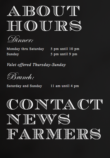
In my opinion, Easy Bistro does not use the single-page concept very well. While the menu on the left is well-designed and includes plenty of information on the page, the navigation on the top of the page takes you out of the site for more info. This seems to take away from the site because the viewer is being pulled to another page. I might have implemented some scrolling technique, for example, when you clicked on ‘reservations’ the page would jump to a lower part that allowed you to make reservations online.
Organization/Hierarchy
The left side of the page has a menu. When each item is clicked, the information for that headline is revealed. This saves space and is an interesting solution.
These headlines along with the images have the most prominence on the page. Because of this, the navigation at the top gets lost. If it were increased in scale and weight, it might have more of a presence in the design. Luckily, it is located at the top of the page, so it is not completely forgotten.
White Space
It looks as if there is enough white space on the page. Some of the images add even more to the white space. The menu has a good amount of negative space, as well.
Color
The color scheme is black and white. The only other color is in the images. The company seems to use this trendy chalk board aesthetic within the restaurant. So, black and white seem appropriate. It gives a fancier feel as well.
Typography
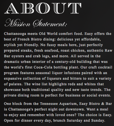
The black and white goes well with the chalk board look and feel. Because of the chalk board look, the headlines are appropriate. This sort of filled-in type contrasts well as headlines with the serif typeface used for body copy, although the body copy is a little too small, becoming tiresome to read. The script font is used for subheads. It would have been interesting to see a more handwritten font like the ones seen in the restaurant image above. Although that would make it look more casual, which I don’t think they were going for.
In the navigation at the top of the page, a tall, condensed sans-serif is used. This works because it is a different type of navigation than that of the navigation on the left. However, it is a thinner typeface and rather small. WIth the images behind it, there are some contrast issues with some images.
Imagery
The logo is made up of small white dots. It has a very classy, romantic feel to it.
Most of the images are shot well, but because the site is responsive they are also very pixelated on my desktop. If you shorten the browser window the images look better. But it kind of defeats the purpose of having great photographs on the site if you can’t see them well. If the images were a higher resolution, it would improve the look and feel of this site greatly. (As a side note, the images look great on a smartphone!)
Leona Lewis’ Website
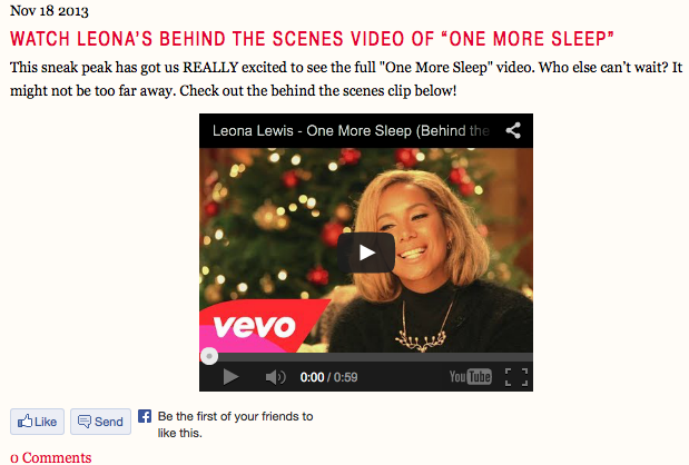
The singer I chose to design a one-page website for is Leona Lewis. Her site is currently promoting her latest holiday album Christmas With Love. The homepage only shows information about that specific album. In order to view more content, you must scroll to the bottom of the screen and click “Enter Website”. This concept contributes to advertising for Lewis’ latest tunes.
Organization/Hierarchy
The site is organized into 13 different tabs. I think this could somehow be shortened, maybe combining Music and Video or Music and Lyrics, etc. 3 of the 13 tabs take you out of the site, so that discourages visitors from staying.
Within each tab, there are headlines, subtitles, body copy, etc and the hierarchy is pretty clear because of scale and color.
White Space
There is a good amount of white space within the site. Here in the music tab, you can see plenty of space between type and image. The texture in the background provides extra negative space and makes the site look cleaner and airer as a whole.
Color
The color scheme is appropriate for the Christmas album, but it doesn’t fit with the rest of the site, or the identity of the artist. The Christmas-themed photography and type stay on the page as a header on every page, which makes this color scheme and style consistent. The texture and color provide good contrast for type and images. The red used for the navigation bar is bright, giving it importance and creating hierarchy on the page.
Typography
The type on the navigation bar is very small and condensed, making it more difficult to read than necessary. The body copy line length is long. But, the sans serif and serif typefaces combine well.
Image & Texture
The Christmas photographs of Leona Lewis are well done and show her personality, which is important for a site about her. The background texture fits well with the color scheme and adds the the design without overwhelming.
Possible Improvements
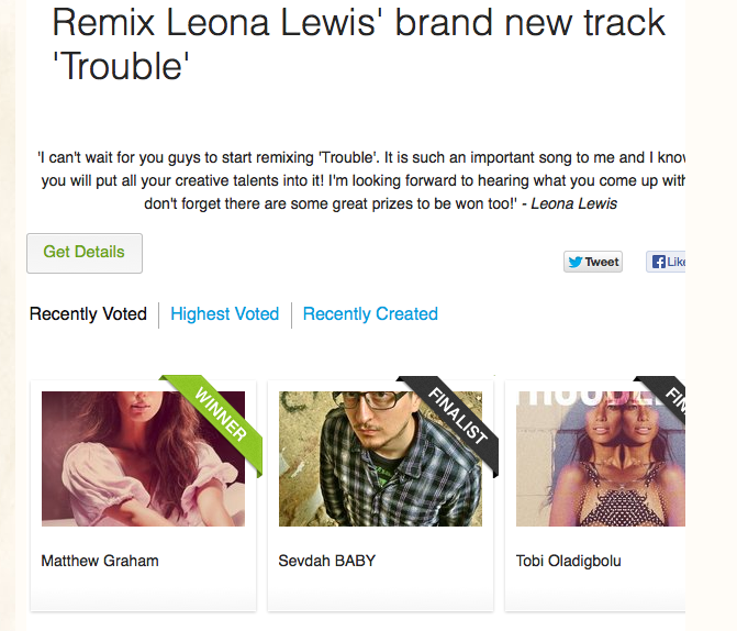
One thing I didn’t understand about the site is the way a scroll bar is used within a page. The example below shows image and type on a page within a window. In order to see all of the content, you must scroll to the left. However, there is not much scrolling needed to view all content. This leads me to believe that it might have made more sense to shorten the line length and decrease the size of the images. Because the type is barely cut off on the sides, it looks like a mistake. Also, a scroll bar is not indicated, so one might think that the content is simply cut off.
Benefits of a Single Page
A single page design could benefit Leona Lewis’ site because right now the site is segmented, resulting in possible confusion. There is no navigation on the first page, so this may lead users of this site to think that the one page is all of the content that will be offered. I love what Rebecca Gill of Web Savvy Marketing says (see full article) relating to navigating websites:
I frequently compare website visitors to toddlers – I love toddlers. Because of this association, I try and make sure our websites are easy to digest and easy to use. I use toddlers not to signify a lack of intelligence, but to highlight a short attention span.
Most website visitors are multi-tasking and they are easily distracted, as is the case of my beloved toddler. To keep visitors on a website, you need to make website content and navigation easy. You can’t expect visitors to think through cute design to get to where they want to go or to locate information they need. If I have to “figure out” how to use your website, your website is not worth my time. As with the toddler, I am constantly multitasking so my attention span is short.
– Rebecca Gill (Web Savvy Marketing)
A one page site would put all of the information in one place, making it simpler, more user-friendly and therefore easier to use. Dividing information into specific sections makes it easier for the user to find what they are looking for, further improving the user-experience.
Sources:
http://demosthenes.info/blog/504/Exploring-The-One-Page-Site-Concept
http://www.leonalewismusic.com/gb/
http://www.web-savvy-marketing.com/2013/07/one-page-websites-templates/


